Brewnoir Café
Brewnoir Café required a distinct, premium visual identity to elevate its market positioning within the competitive specialty coffee sector. Aiming to establish itself as a modern, high-end destination for artisanal beverages and gourmet light bites, the café needed a branding system that reflected sophistication, consistency, and craftsmanship. The primary objective of this project was to establish a cohesive visual presence across physical storefront signage, takeaway packaging, menus, and branded touchpoints, anchored by the tagline “Every bean to excellence”.
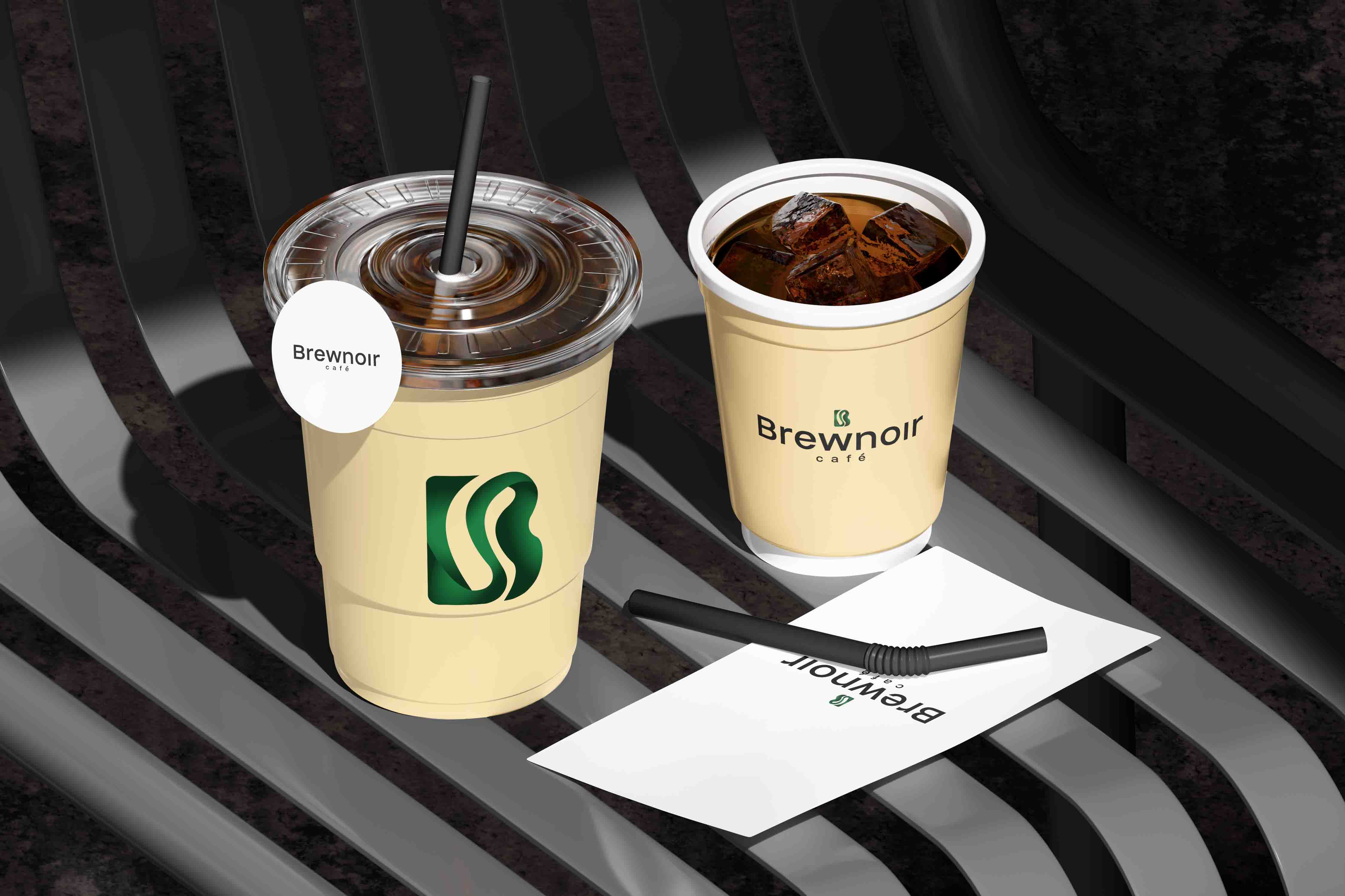
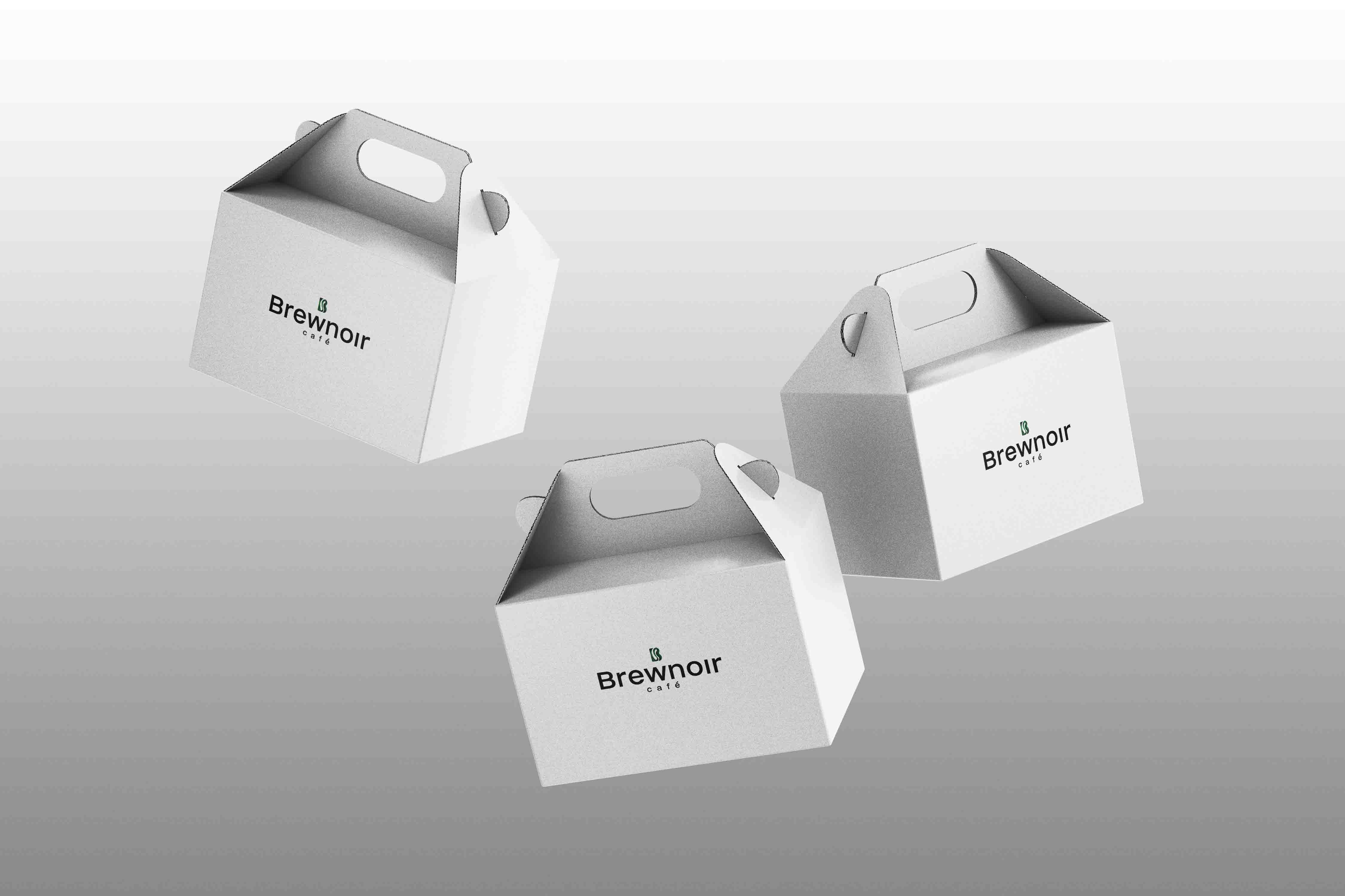
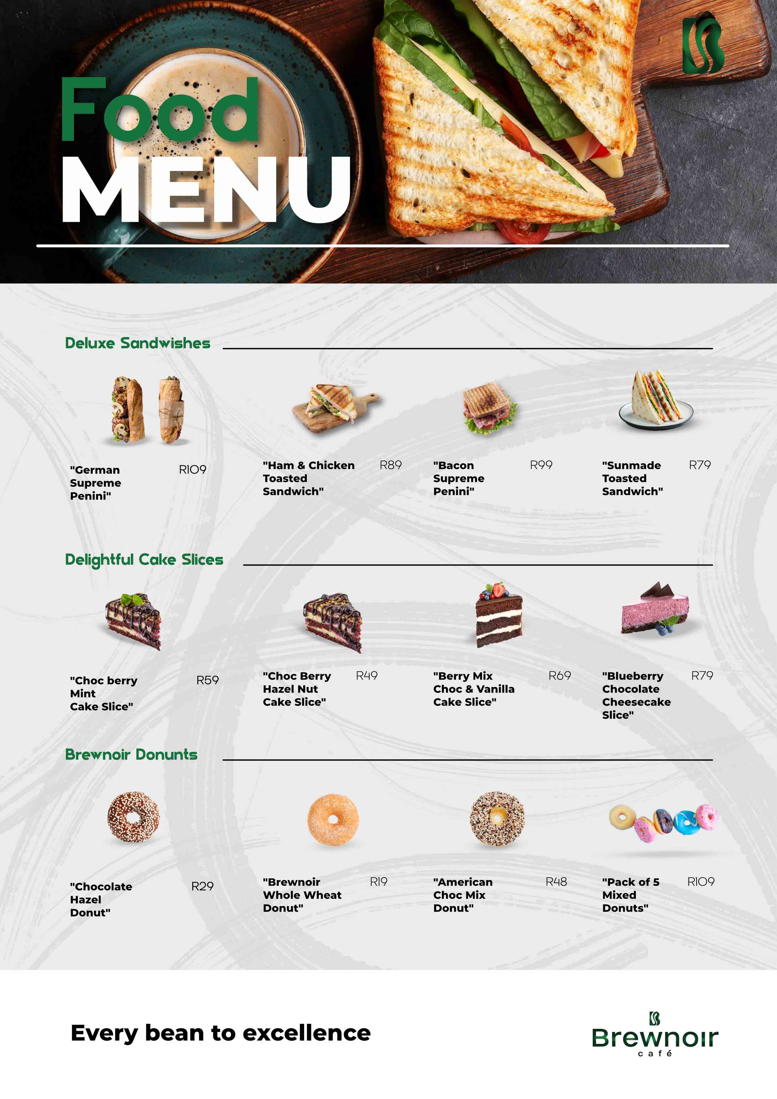
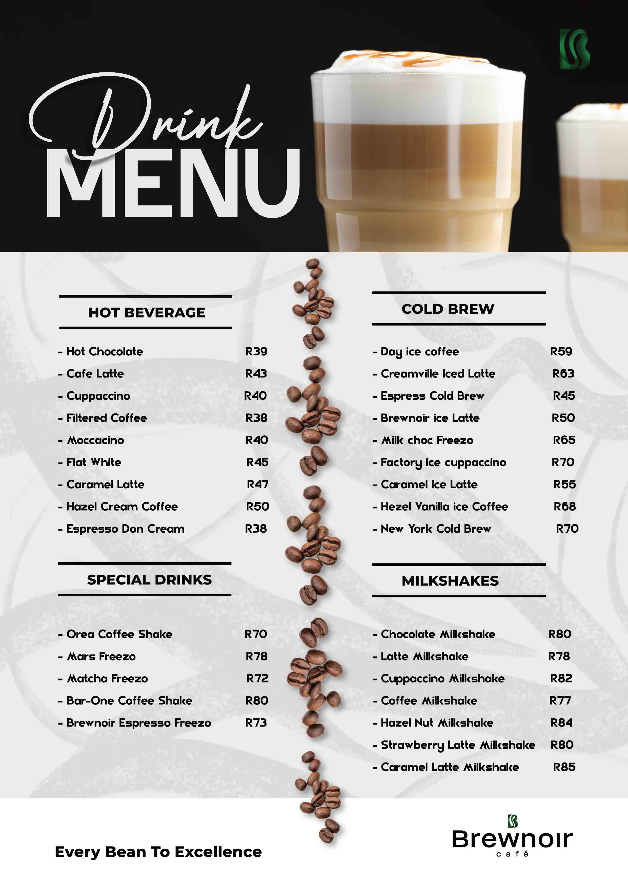
The visual identity of Brewnoir Café balances contemporary minimalism with rich, organic elements. At the core of the identity is a monogram emblem shaped as a stylized letter ‘B’, formed by flowing, ribbon-like curves in a rich emerald green gradient that subtly mimics coffee steam or a stylized coffee bean. The primary typography features a bold, clean sans-serif wordmark for “Brewnoir” paired with a widely spaced, lowercase subtitle for “café” to maintain a balanced, modern lockup. The brand’s colour palette relies on high-contrast pairings of deep black, crisp white, warm cream, and signature emerald green. This application extends across iced coffee cups, warm-toned takeaway boxes, sleek black storefront signage, and structured print menus featuring organised sections for Hot Beverages, Cold Brews, Special Drinks, Milkshakes, Deluxe Sandwiches, Cake Slices, and Donuts.
Brand Identity Breakdown
Logo Design
 icon
 Combination
 wordmark
Colour palette
- #C6B198
- #A57C52
- #0B2F18
- #1B763D
Menu Design
Brand Application